
Learn everything you need to know about responsive web design in this blog.
Technology is evolving at lightning speed. In the last ten years, we’ve seen a dramatic shift in the way people access information online. Nowadays, people access the world wide web on screens that can fit into your back pocket. This change forced business owners to rethink their web design strategy to accommodate for these micro-devices. Thus, a new method for designing websites was born: enter, responsive web design.
In today’s article, we’ll cover everything you need to know about responsive web design. Let’s get started.
What is responsive web design?
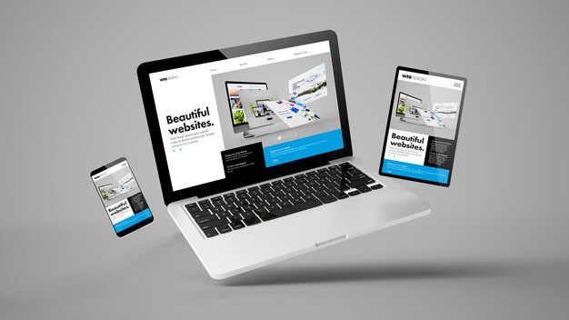
In simple and easy terms, a responsive web design definition is that the website will look good on any device. Responsive therefore means, how a website will respond based on the device that is viewing the site. To make the site responsive the design approach involves enabling webpages to stretch, shrink, or expand depending on the screen size and capabilities of the device it is being accessed on. Responsive web design is a key component to what many marketers call the “mobile-first” approach; a methodology where you design for the smallest screen first—the smartphone screen—and work your way up.
How does responsive web design work?
The techniques applied in responsive web design work through Cascading Style Sheets (CSS). The three main principles of responsive web design are:
1. Fluid Grid Systems
Before the invention of the internet, printed content was thought of in absolute terms. Pages were a certain width and images contained a certain number of pixels. These numbers were unchanging. In responsive design, one adopts the notion of “relative size,” where element sizes adjust according to the specifications of each device. Layouts are based on a percentage value instead of set pixels. The ratios are the same, they are just adapted according to each situation.
2. Fluid Image Use
Fluid image use refers to the use of images within responsive web design, and their ability to adapt to fit the container when displayed on different devices. In this element, a CSS command is used to ensure the image displays at a maximum of 100% of its pixel value.
3. Media Queries
Media queries allow web designers to adjust the layout of a website according to the space available on each device. A webpage that contains three columns of content when accessed on a desktop, for example, might adjust to appear as only having one column on a smartphone to improve readability. Media queries check for elements like width, resolution, and orientation of a device and in turn display the correct set of CSS rules.
A Few Tips and Tricks
Now that you have a better idea as to what web design is and how to apply it, here are a few tips and tricks to help you get started:
• Use “finger friendly” CTA buttons. Ensure buttons are a circular or rectangular shape, and add gradients, shadows, and contrasting colours to ensure the buttons are accessible by all.
• Optimize typography. Content should be legible on all screen sizes. Avoid fancy, cursive fonts, and use 16px as the go-to size for regular copy.
• Less is more. When it comes to responsive web design, the less “flash,” the better. Keep design simple; users should be able to navigate through your site with ease, and understand at a glance what your company is about.
• Consider touch screens. The majority of smartphone and tablet users access the internet through a touch screen. Be sure to keep this in mind when designing your site. Forms, links, and call-to-action buttons should be large enough to click with the tip of a finger.
• Take advantage of smartphone features. Smartphones can send messages and emails, make phone calls, and open apps directly from a browser. Use this to your advantage in places like the contact page, where instead of offering a form, you can add a button that automatically prompts a call to the sales team.
Responsive web design is the new web design. Our world is constantly evolving, and it’s important your website evolves with it. By ensuring your site is accessible by all devices, you will provide the best possible user experience for new and existing customers.
Mobile First
Google predominantly uses a mobile first policy, meaning the mobile version of a website is used for determining indexing and ranking. In a historical context, the desktop version of a website was used for evaluating page relevancy when a user would institute a search on Google. To give more accurate search results, Google states that they now index pages primarily with the smartphone agent. See this article on Google Search Central for more mobile-first indexing best practices. If a website is not designed with responsive web design techniques, there is a good chance the site will be scored lower when being crawled, and therefore, be indexed in a lower position. To understand more about Google Search, and why this is important for your website to be found online, checkout our article, SEO Strategy & the importance of SEO content marketing.